Architecture must move on from an addiction to spectacle and fad, adrift in a sea of meaningless forms, leaving serious design and sustainability problems unresolved, says Peter Buchanan. But to do this will require a more critical perspective from architectural academe and the media.
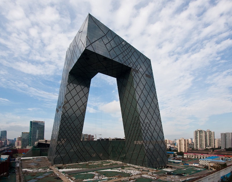

Empty Gestures: Starchitecture’s Swan Song
By Peter Buchanan, Published in The Architectural Review
Future architects will look back at our times astounded by our confusions, gullibility and inability to exercise critical judgement. This is especially true in relation to the current fads for icons and Parametricism, such as the works of Frank Gehry and Zaha Hadid. But at least some of these have a sort of energy and sculptural seductiveness; the admiration of non-architects is understandable. Worse is the Postmodern penchant for deriving design from preposterous concepts, resulting in clumsy works like Rem Koolhaas’s CCTV in Beijing and Peter Eisenman’s City of Culture in Santiago de Compostela. The flaws in all this stuff, Parametricist and Postmodern alike, and its utter irrelevance to the urgent problems of our times, are so obvious future generations will be aghast it was ever taken seriously, let alone mistaken for heralds of the future.
The current emphasis on exaggerated sculptural form — like architecture derived to exemplify a theoretical position, accommodate spurious scenarios or generated aleatorically from sequences of formalist moves (now aka ‘scripts’) — dates back to the 1980s and its elevated acclaim for ‘experimental’ paper architecture. This era saw the breakdown of the simple certainties of modern architecture, boredom with the arid abstraction of its forms, the broadening of critical perspectives (starting with post-colonial and feminist critiques, but eventually degenerating into turgid theorizing) and the turn to art for inspiration as well as to theory and scenarios. Yet from this pluralist smorgasbord nothing appeared that was likely to prove truly satisfying over the long term nor relevant to the increasingly pressing problems we face. Instead it all deteriorated into a quest not for lasting relevance but rather for immediate impact and exciting novelty in dynamically gesturing form — much of it reminiscent of the artwork of record covers or buildings in sci-fi films of the decades before — that was assumed to be expressive of the zeitgeist.
In due course this formal posturing was both spurred on and rendered realizable by the power of the computer and its various new software packages bringing the capacity to execute more or less any shape, budget permitting. But nobody thought to ask the obvious question as to which of these forms might be relevant to architecture, and not only in terms of functionality, which tolerantly accommodates itself to almost anything. Particularly apt would have been to question which forms elicit relationships — with us humans, both perceptually and psychologically, as well as with other buildings and external space — and so can aggregate into satisfactory urban fabric in which we can feel at home. (There are, of course, perverse Postmodernists who claim this need not be a concern of architecture and, almost unbelievably, still get away with it.)
Various very unconvincing justifications are offered for pursuing icons and Parametricism, beyond the whizzy encapsulation of the zeitgeist. Still commonly voiced in parts of academe is what used to be called, particularly in relation to High-Tech architecture, the technological imperative: an obligation to explore and exploit what technology makes possible. But, quite apart from the destruction of the planet wrought by such lack of discrimination, the buildings they endorse are not technologically advanced, particularly in terms of such things as resource efficiency and environmental performance, both of which they are particularly bad at.1 Others argue that these complex forms, particularly in the spatial fluidity they afford, are required by new social programmes. But, besides the period of new social programmes necessitating new functional types being in the past, spatially and functionally these buildings achieve nothing that Aalto and Niemeyer, for instance, didn’t do with much greater precision and economy. Yet others justify these biomorphic forms in terms of biophilia or biomimicry, preposterous claims because neither laudable approach involves merely mimicking nature’s forms. Instead biophilia implies revering planetary life in preserving and highlighting the presence of nature itself, and seeking a regenerative symbiosis with its species and processes — not just to benefit the planet but human physical and mental health too. And biomimicry involves learning from the myriad ways nature works and the strategies and devices it has evolved to adapt itself to diverse and challenging conditions. No equivalent of either approach is found in icons and Parametricism.
STORY: Austria: Energy-Efficient Office Tower Rises Over the Danube


Sunset Effect: An Exaggerated Caricature
Before cutting short what could be a long litany of such criticisms, let’s refute the outrageous claim that these represent the future of architecture. Such is the thesis of, for instance, Patrik Schumacher in his epic two-volume tome The Autopoeisis of Architecture that seeks to become the bible for Parametricism, the term he popularized. Parametricism cannot become the long-term successor to Modernism because, like nearly all starchitecture, it ignores and exacerbates the urgent challenges of our time, such as the environmental crisis and the need to reintegrate ruptured urban fabric. Instead it is a perfect example of what Marshall McLuhan aptly termed a sunset effect, an exaggerated caricature of now obsolete characteristics of a waning era. Parametricism and icons exacerbate rather than solve the main failings of modern architecture, and not only because they are energy-profligate, anti-urban, stand-alone buildings that fail to define urban space and defy relationship with other buildings and humans.
For instance, Functionalism (a central tenet of modern architecture) focused on human action as objectively observed, so ignoring (even denying) the subjective dimensions of the psyche and thus denigrating a key part of our fundamental humanity. This marginalization of our humanity is now taken to an extreme by Parametricism, icons and so on. Another failing of modern architecture also now pushed to an extreme, is the over-emphasis on sculptural form, so neglecting such things as the pattern and rhythm of facade articulation. Yet these are essential to creating a sense of place and investing buildings with a liveliness that helps us relate to them.2 Parametricism and icons thus in reality climax and say goodbye to certain pathologies of modern architecture ? and so have absolutely nothing to do with the future. This point cannot be over-stressed.
Yet it must also be emphasised strongly that none of the above comment should be mistaken for a rejection of the parametric software and modelling used to generate the forms of these buildings and then execute them. These are powerfully useful tools crucial to the future of architecture when in the hands of the discriminating and when put to good purpose, such as to explore new formal topologies that bring new efficiencies and economies and achieve seemingly organic levels of synthesis of all the factors shaping a design. Similarly no criticism is implied of biophilia and biomimicry, both of which are vitally pertinent, in ethos and strategy, to a sustainable future.
STORY: Ecological Urbanism: A City Green Re-Imagination
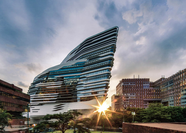

Ego-Expression Architecture of Nowhere
That starchitecture is a sunset effect exaggeration of Modernist pathologies is clearly demonstrated by the work of Zaha Hadid and Frank Gehry, particularly the Innovation Tower in Kowloon and the Fondation Louis Vuitton in Paris (AR November 2014). Both arrogantly flaunt their refusal to defer to local context and its codes (implicit as well as explicit), announcing instead that the supposed right to ego-expression of a starchitect trounces all such decencies. At the end of (terminating would be too purposive a term) a sequence of open spaces framed by reticent brick buildings that forms the spine of the Kowloon campus, the gleaming white Innovation Tower resembles an icy and fissured asteroid that has smashed down from outer space — but sadly this brutally intrusive object will not be melting away. Besides there being no relationship between the building and its setting, there is none between its outside and inside, nor between the internal movement sequence and interior spaces.
Hadid’s radical stance as a practitioner has not changed since she was a student. For years, she submitted abstract drawings and paintings to convey her ideas, because, as she would explain with absolute conviction to dubious clients, abstraction was the best way to capture multiple perspectives in two dimensions, and to bring them together in a “distortion field.” — John Seabrook in the New Yorker
Without evident logic to its external form, nothing suggests it was designed for this site: around it is useless amorphous space, some of it concrete ramps, and the transition between the concrete base and the enamelled steel-clad superstructure is excruciatingly ill-considered. Then on entering the building, you are confronted by grand long escalators that climb to … not the tall volume revealing the whole interior that you’d expect; instead you are confronted by a blank wall across a cramped space. What an anti-climax. Navigating past this leads eventually to some cramped tall volumes arbitrarily positioned within the movement sequence (and in one of which the fenestration is quite unrelated to the interior volume) and a central stair and circulation hall. This is of dynamically fluid form, but the stair is much too narrow to permit people moving up and down to comfortably pass. Exploring further reveals that the external form does not relate to the rooms inside; these are clumsily sliced up in the residual space between external skin and corridors.
So it goes on: besides exaggerating the flaws of Modernism, the Innovation Tower also ignores its key virtues, such as in devising designs that are not only tailored to function but that also unfold and reveal themselves along a processional sequence that entices you ever forward. Visiting the building a week after completion, its internal glazed partitions were already plastered with paper as students sought to gain some privacy and render them functional. But at least the white painted concrete, unprotected by copings or rails even when forming balustrades, were not yet grubby, as they must soon become. But to be fair, the Innovation Tower seems an exceptionally weak example of Hadid’s newer works. The recent opera houses in Guangzhou, China, and Baku, Azerbaijan, appear seductively fluid and sleek in photographs. On the other hand, the Sky SOHO project for Shanghai seems just another set of conventional slabs styled up with rounded ends, curving linking bridges and what looks like the arbitrarily applied chrome trim found on a cheap toaster. Styled is the key word, these arbitrary and scaleless streamlined forms and trim are a far cry from the disciplined synthesis associated with quality design of any sort, including architecture.
Frank Gehry’s Fondation Louis Vuitton is a grotesque imposition, in the eyes of some well-to-do local residents, standing as a brash monument to the fact that the country’s richest man can get his own way. Planning codes prohibit building in the protected natural site of the Bois de Boulogne, but structures are allowed under special circumstances, if they reach a height of no more than one-storey. A local campaign saw the project successfully halted in the courts, but then the National Assembly intervened declaring it was “a major work of art for the whole world” and must go ahead. — Oliver Wainwright in The Guardian
STORY: Frank Gehry: Toronto’s Trio of Living Sculptures
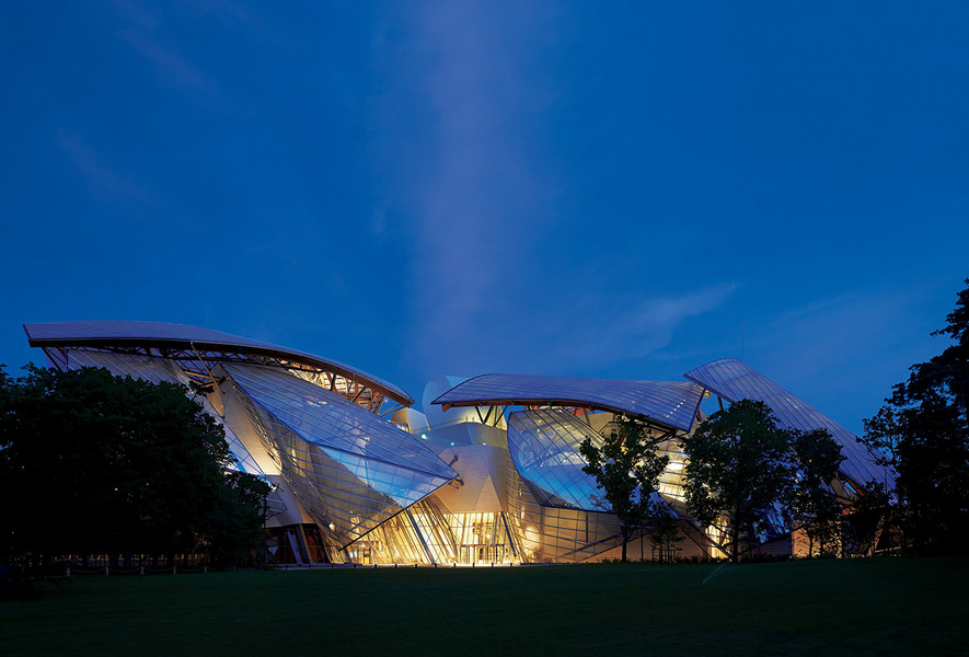

The Danger of Big Budgets in Paris
A similar arrogant disregard for setting is displayed by Gehry’s Fondation Louis Vuitton in Paris’s Bois de Boulogne. Here the stipulation that construction be limited to two storeys to preserve the sense of uninterrupted woodland when overlooking the area might be technically honoured but is flagrantly disregarded in spirit, exemplifying a starchitect’s sense of an egotistical right to conspicuous self-expression that should trounce the desires and decorum of the collective. The result is an explicit monument to the anti-democratic, neoliberal ethos of our increasingly unequal times when rich individuals and corporations feel entitled to trample us with architectural bling. Oxygen of publicity Here though, there is a major element that is technically accomplished, if also essentially gratuitous — the huge, gossamer and geometrically disciplined, fritted glass sails that float above and obscure the solidly enclosed part of the building. In their minimalist detail and refined elegance these are clearly the work of the French engineering and architectural firm RFR; it has long been exploring bent glass, a much more difficult material to handle than malleable sheet metal claddings, and has the mathematical skills to refine the geometry. It is not clear though where the role of RFR begins and ends as the chaos of struts leaning out at various angles to support these sails looks less like RFR and more typical of Gehry — whose randomly collagist approach to design is clearly evident in the interiors planned without any evident discipline and logic.
The contrast between the diaphanous sails and the lumpy building proper is almost suggestive of butterflies hovering over a turd — You’re right Mr Gehry, much contemporary architecture is shit.
Comparing the Fondation Louis Vuitton with the Biomuseum in Panama reveals the constraints of a more normal budget and emphasises the spectacular extravagance of the Paris building. In the light of current circumstances and the many deserved criticisms already offered, are such buildings really worthy of adulation and declarations of architectural genius? Is some such realisation behind the insecurity that makes Gehry so touchy. Yet in time, and especially with the benefit of an inspired curatorial agenda, the Fondation promises to become a treasured part of Paris — like the Eiffel Tower. But like the latter, is it really architecture or, like the Bilbao Guggenheim, a species of usable sculpture? Architecture, once the encompassing mother of the arts, completed by sculpture and painting, and carrier of cultural significance and meaning, has become reduced to superfluous spectacle.
More than that, the attention attracted by works like those of Gehry and Hadid impedes the rethinking of architecture that is so desperately overdue. We need to move on from the adolescent search for momentary excitement and spectacle to a more mature architecture of synthesis and subtlety that reveals its understated riches over time. But that would entail architectural academe and media developing a much more searchingly critical attitude to architecture and how it is assessed so as to help us move forward to an architecture relevant and adequate to the manifold challenges of our time. To do this it also would help if we ignored, and starved of the oxygen of publicity, the architectural nonsense too long applauded in our times.
References
1. A simple comparison of two buildings for the London 2012 Olympics makes this clear. Zaha Hadid Architects’ Aquatics Centre and Hopkins Architects’ Velodrome have roofs of similar area, yet the former required 6,000 tonnes of structural steel to support it and the latter only 1,000 tonnes. And the shape of the latter channelled air movements so that the mechanical ventilation is very efficient (AR September 2012).
2. This is a subtle yet crucial point that initially baffles most architects, but which there is no space to elaborate here. To explore it further, read The Old Way of Seeing by Jonathan Hale, parts of Volume One of The Nature of Order by Christopher Alexander and my essay ‘Place and Aliveness’ (AR August 2012).






Pingback: A Marked Beast: Trump’s Son-In-Law’s 666 Fifth Avenue | WilderUtopia.com